Revamping the in-house dashboard to restructure navigation flows
RN Chidakashi Technologies develops advanced consumer robotics innovations. Their flagship robot adapts to kid's personalities, turning curiosity into lifelong discovery. I was a part of the HR team and worked to improve the user experience of the existing dashboard and improved information architecture.
Managing HR operations like employee data, leave approvals, and incentives through Excel is time-consuming and error-prone, requiring constant navigation across cluttered spreadsheets. While the team introduced a dashboard to centralize these tasks, its disorganized design, developed without HR input, created inefficiencies. There was an urgent need for an intuitive, HR-focused dashboard to restructure workflows, reduce administrative strain, and enable quick access to critical employee information.
Timeline
Jul 2021 - Jun 2022
Collaborators
4 UX Designers - Me! & 3 others
2 Engineers
2 Project Managers
Responsibilities
UX Research
UX Design
Tools
Figma
Figjam
Google Docs
What was my role in the project?
I played a key role in the project by conducting user interviews with HR team members to validate pain points and ensure our design solutions addressed real user needs. I developed the style guide, defining the color palette and typography guidelines, and built a library of reusable atomic components for consistency. Leading the design of the Home, Attendance, and Organization pages, I collaborated with another designer to improve navigation.

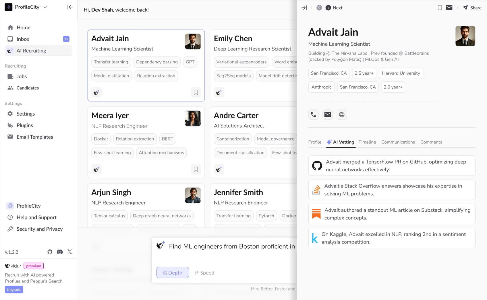
Fig. 1- Redesigned dashboard with improved navigation
Impact
Reduced navigation-related support queries by 40% by redesigning UI.
Increased HR team satisfaction by 33% through improved workflows
Migrated 20% of Excel data to the dashboard for faster HR access.
Cut HR workload by 54% by streamlining a 13-step process into 6 steps
Discovering the problem
What are the primary challenges we need to address?
The HR team was trapped between two inefficient systems
Overuse of the excel spreadsheets
The Excel sheets required maintenance and manual updates, creating version control issues. This made it difficult to spot patterns or generate insights, while also increasing the potential for errors and data inconsistencies.

Fig. 2- Concerns of the HR Team with Excel use
Technical limitations of the original dashboard
The navigation was cluttered, and the lack of a clear information hierarchy made it difficult to use. Inconsistent design patterns added to the confusion, and users still had to rely on Excel for certain tasks, despite the dashboard being in place.

Fig. 2- Problems with existing dashboard
Identifying problems with users
To validate the identified problems I conducted interviews with 6 HR team members and 2 developers to gain a deeper understanding of their pain points, workflows, and challenges, ensuring that the design solutions were aligned with their needs.

participants reported challenges in managing data for employee attendance records.
participants expressed challenges navigating the existing dashboard
participants felt overwhelmed by switching between Excel and the dashboard
Fig. 4- Findings from interviews
Emotional Impact on users

Fig. 5- User quotes from interviews
Translating research into meaningful outcomes
To make sense of user insights, turning them into a clear and structured narrative, I chose the 5W1H framework. It helped us to break down research in a way that made the problem easy to understand, got everyone on the same page, and led to define our design goal.

Fig. 6- Findings from interviews
Navigating iterations
My design journey for the HR dashboard was an intentional, iteratively refining the solution to meet the team's core operational needs. Through systematic explorations, I transformed a conceptual interface into a user-centered design solution.
Exploration 1
Focused on company announcements and leave approvals, but it did not address user needs. I learned design must solve problems, not just present data.

Fig. 7- Exploration 1
Exploration 1.1
Attempted to combine announcements with attendance tracking. Discovered that adding features doesn't automatically improve user experience or clarity.

Fig. 8- Exploration 1.1
Exploration 2
Created an attendance tracking cards that failed to meet design standards. Recognized the gap between conceptual design and approved style guide.

Fig. 9- Exploration 2
Exploration 2.1
Breakthrough design that prioritized HR team's core needs. Successfully simplified attendance monitoring and leave management through targeted, user-centric design.

Fig. 10- Exploration 2.1
Framing our design goals
"How might we redesign the company overview section to provide candidates with the essential information they need while helping companies effectively showcase their brand?"
We focused on three core objectives:
Improve data organization by restructuring the original information architecture to reduce cognitive load for the HR team.
Streamline navigation by creating intuitive navigation to establish clear pathways
Enhance actionability by grouping related tasks to increase task completion efficiency
Creating reusable atomic components
I developed atomic components that establish a cohesive visual language and accelerates design workflows. By breaking down the dashboard into reusable, granular elements, I created a flexible framework that enables rapid prototyping, ensures design consistency

Fig. 11- The reusable components for the dashboard redesign
Final Solution
I supported the HR department by mapping critical workflow challenges and designing solutions that directly improved operational efficiency. My contributions centered on designing the Home, Attendance and Organization pages.
Fig. 12- Final Solution
My learnings
What were my takeaway from this project?
Finding the middle ground between ideal solutions and technical constraints required constant negotiation and creative problem-solving. I learned that imperfect solutions that ship are better than perfect solutions that never do.
While aesthetics matter, the HR team needed functionality above all. This forced me to prioritize usability improvements over visual enhancements when resources were limited.
For the HR team, saving even 15 minutes per day represented hours of reclaimed time each month. I learned that seemingly minor UX improvements can dramatically improve daily work experiences.
Check out my recent work
Revamping the in-house dashboard to restructure navigation flows
RN Chidakashi Technologies develops advanced consumer robotics innovations. Their flagship robot adapts to kid's personalities, turning curiosity into lifelong discovery. I was a part of the HR team and worked to improve the user experience of the existing dashboard and improved information architecture.
Managing HR operations like employee data, leave approvals, and incentives through Excel is time-consuming and error-prone, requiring constant navigation across cluttered spreadsheets. While the team introduced a dashboard to centralize these tasks, its disorganized design, developed without HR input, created inefficiencies. There was an urgent need for an intuitive, HR-focused dashboard to restructure workflows, reduce administrative strain, and enable quick access to critical employee information.
Timeline
Jul 2021 - Jun 2022
Collaborators
4 UX Designers - Me! & 3 others
2 Engineers
2 Project Managers
Responsibilities
UX Research
UX Design
Tools
Figma
Figjam
Google Docs
Fig. 1- Redesigned dashboard with improved navigation
What was my role in the project?
I played a key role in the project by conducting user interviews with HR team members to validate pain points and ensure our design solutions addressed real user needs. I developed the style guide, defining the color palette and typography guidelines, and built a library of reusable atomic components for consistency. Leading the design of the Home, Attendance, and Organization pages, I collaborated with another designer to improve navigation.
Impact
Reduced navigation-related support queries by 40% by redesigning UI.
Increased HR team satisfaction by 33% through improved workflows
Migrated 20% of Excel data to the dashboard for faster HR access.
Cut HR workload by 54% by streamlining a 13-step process into 6 steps
Discovering the problem
What are the primary challenges we need to address?
The HR team was trapped between two inefficient systems
Overuse of the excel spreadsheets
The Excel sheets required maintenance and manual updates, creating version control issues. This made it difficult to spot patterns or generate insights, while also increasing the potential for errors and data inconsistencies.
Fig. 2- Concerns of the HR Team with Excel use
Technical limitations of the original dashboard
The navigation was cluttered, and the lack of a clear information hierarchy made it difficult to use. Inconsistent design patterns added to the confusion, and users still had to rely on Excel for certain tasks, despite the dashboard being in place.
Fig. 2- Problems with existing dashboard
Identifying problems with users
To validate the identified problems I conducted interviews with 6 HR team members and 2 developers to gain a deeper understanding of their pain points, workflows, and challenges, ensuring that the design solutions were aligned with their needs.
participants reported challenges in managing data for employee attendance records.
participants expressed challenges navigating the existing dashboard
participants felt overwhelmed by switching between Excel and the dashboard
participants reported challenges in managing data for employee attendance records.
participants expressed challenges navigating the existing dashboard
participants felt overwhelmed by switching between Excel and the dashboard
Fig. 4- Findings from interviews
Emotional Impact on users
Fig. 5- User quotes from interviews
Translating research into meaningful outcomes
To make sense of user insights, turning them into a clear and structured narrative, I chose the 5W1H framework. It helped us to break down research in a way that made the problem easy to understand, got everyone on the same page, and led to define our design goal.
Fig. 6- Findings from interviews
Framing our design goals
"How might we redesign the company overview section to provide candidates with the essential information they need while helping companies effectively showcase their brand?"
We focused on three core objectives:
Improve data organization by restructuring the original information architecture to reduce cognitive load for the HR team.
Streamline navigation by creating intuitive navigation to establish clear pathways
Enhance actionability by grouping related tasks to increase task completion efficiency
Navigating iterations
My design journey for the HR dashboard was an intentional, iteratively refining the solution to meet the team's core operational needs. Through systematic explorations, I transformed a conceptual interface into a user-centered design solution.
Exploration 1
Focused on company announcements and leave approvals, but it did not address user needs. I learned design must solve problems, not just present data.
Fig. 7- Exploration 1
Exploration 1.1
Attempted to combine announcements with attendance tracking. Discovered that adding features doesn't automatically improve user experience or clarity.
Fig. 8- Exploration 1.1
Exploration 2
Created an attendance tracking cards that failed to meet design standards. Recognized the gap between conceptual design and approved style guide.
Fig. 9- Exploration 2
Exploration 2.1
Breakthrough design that prioritized HR team's core needs. Successfully simplified attendance monitoring and leave management through targeted, user-centric design.
Fig. 10- Exploration 2.1
Creating reusable atomic components
I developed atomic components that establish a cohesive visual language and accelerates design workflows. By breaking down the dashboard into reusable, granular elements, I created a flexible framework that enables rapid prototyping, ensures design consistency
Fig. 11- The reusable components for the dashboard redesign
Final Solution
I supported the HR department by mapping critical workflow challenges and designing solutions that directly improved operational efficiency. My contributions centered on designing the Home, Attendance and Organization pages.
Fig. 12- Final Solution
My learnings
What were my takeaway from this project?
Finding the middle ground between ideal solutions and technical constraints required constant negotiation and creative problem-solving. I learned that imperfect solutions that ship are better than perfect solutions that never do.
While aesthetics matter, the HR team needed functionality above all. This forced me to prioritize usability improvements over visual enhancements when resources were limited.
For the HR team, saving even 15 minutes per day represented hours of reclaimed time each month. I learned that seemingly minor UX improvements can dramatically improve daily work experiences.
Check out my recent work
Revamping the in-house dashboard to restructure navigation flows
RN Chidakashi Technologies develops advanced consumer robotics innovations. Their flagship robot adapts to kid's personalities, turning curiosity into lifelong discovery. I was a part of the HR team and worked to improve the user experience of the existing dashboard and improved information architecture.
Managing HR operations like employee data, leave approvals, and incentives through Excel is time-consuming and error-prone, requiring constant navigation across cluttered spreadsheets. While the team introduced a dashboard to centralize these tasks, its disorganized design, developed without HR input, created inefficiencies. There was an urgent need for an intuitive, HR-focused dashboard to restructure workflows, reduce administrative strain, and enable quick access to critical employee information.
Timeline
Jul 2021 - Jun 2022
Collaborators
4 UX Designers - Me! & 3 others
2 Engineers
2 Project Managers
Responsibilities
UX Research
UX Design
Fig. 1- Redesigned dashboard with improved navigation
What was my role in the project?
I played a key role in the project by conducting user interviews with HR team members to validate pain points and ensure our design solutions addressed real user needs. I developed the style guide, defining the color palette and typography guidelines, and built a library of reusable atomic components for consistency. Leading the design of the Home, Attendance, and Organization pages, I collaborated with another designer to improve navigation.
Impact
Reduced navigation-related support queries by 40% by redesigning UI.
Increased HR team satisfaction by 33% through improved workflows
Migrated 20% of Excel data to the dashboard for faster HR access.
Cut HR workload by 54% by streamlining a 13-step process into 6 steps
Discovering the problem
What are the primary challenges we need to address?
The HR team was trapped between two inefficient systems
Overuse of the excel spreadsheets
The Excel sheets required maintenance and manual updates, creating version control issues. This made it difficult to spot patterns or generate insights, while also increasing the potential for errors and data inconsistencies.
Fig. 2- Concerns of the HR Team with Excel use
Technical limitations of the original dashboard
The navigation was cluttered, and the lack of a clear information hierarchy made it difficult to use. Inconsistent design patterns added to the confusion, and users still had to rely on Excel for certain tasks, despite the dashboard being in place.
Fig. 2- Problems with existing dashboard
Identifying problems with users
To validate the identified problems I conducted interviews with 6 HR team members and 2 developers to gain a deeper understanding of their pain points, workflows, and challenges, ensuring that the design solutions were aligned with their needs.
participants reported challenges in managing data for employee attendance records.
participants expressed challenges navigating the existing dashboard
participants felt overwhelmed by switching between Excel and the dashboard
participants reported challenges in managing data for employee attendance records.
participants expressed challenges navigating the existing dashboard
participants felt overwhelmed by switching between Excel and the dashboard
Fig. 4- Findings from interviews
Emotional Impact on users
Fig. 5- User quotes from interviews
Translating research into meaningful outcomes
To make sense of user insights, turning them into a clear and structured narrative, I chose the 5W1H framework. It helped us to break down research in a way that made the problem easy to understand, got everyone on the same page, and led to define our design goal.
Fig. 6- Findings from interviews
Framing our design goals
"How might we redesign the company overview section to provide candidates with the essential information they need while helping companies effectively showcase their brand?"
We focused on three core objectives:
Improve data organization by restructuring the original information architecture to reduce cognitive load for the HR team.
Streamline navigation by creating intuitive navigation to establish clear pathways
Enhance actionability by grouping related tasks to increase task completion efficiency
Navigating iterations
My design journey for the HR dashboard was an intentional, iteratively refining the solution to meet the team's core operational needs. Through systematic explorations, I transformed a conceptual interface into a user-centered design solution.
Exploration 1
Focused on company announcements and leave approvals, but it did not address user needs. I learned design must solve problems, not just present data.
Fig. 7- Exploration 1
Exploration 1.1
Attempted to combine announcements with attendance tracking. Discovered that adding features doesn't automatically improve user experience or clarity.
Fig. 8- Exploration 1.1
Exploration 2
Created an attendance tracking cards that failed to meet design standards. Recognized the gap between conceptual design and approved style guide.
Fig. 9- Exploration 2
Exploration 2.1
Breakthrough design that prioritized HR team's core needs. Successfully simplified attendance monitoring and leave management through targeted, user-centric design.
Fig. 10- Exploration 2.1
Creating reusable atomic components
I developed atomic components that establish a cohesive visual language and accelerates design workflows. By breaking down the dashboard into reusable, granular elements, I created a flexible framework that enables rapid prototyping, ensures design consistency
Fig. 11- The reusable components for the dashboard redesign
Final Solution
I supported the HR department by mapping critical workflow challenges and designing solutions that directly improved operational efficiency. My contributions centered on designing the Home, Attendance and Organization pages.
Fig. 12- Final Solution
My learnings
What were my takeaway from this project?
Finding the middle ground between ideal solutions and technical constraints required constant negotiation and creative problem-solving. I learned that imperfect solutions that ship are better than perfect solutions that never do.
While aesthetics matter, the HR team needed functionality above all. This forced me to prioritize usability improvements over visual enhancements when resources were limited.
For the HR team, saving even 15 minutes per day represented hours of reclaimed time each month. I learned that seemingly minor UX improvements can dramatically improve daily work experiences.